Brandon Aspromonte's Portfolio

-See my work-

Contact Me

Click that beautiful email down there to get in contact with me

[email protected]

About Me

My name is Brandon Aspromonte, I am a third year student in the Vanier program OST: Micropublishing and Hypermedia. I am skilled in applications such as InDesign, Illustrator, Photoshop and DreamWeaver. I am more focused on the web aspect of things but I still enjoy doing graphic work. I love creating websites and see it come to life after spending some time putting it together.

The goal of my portfolio is to display my work from the last 3 years and to see my progress over the years. You will find a variety of projects that I enjoyed making and that came out really good.
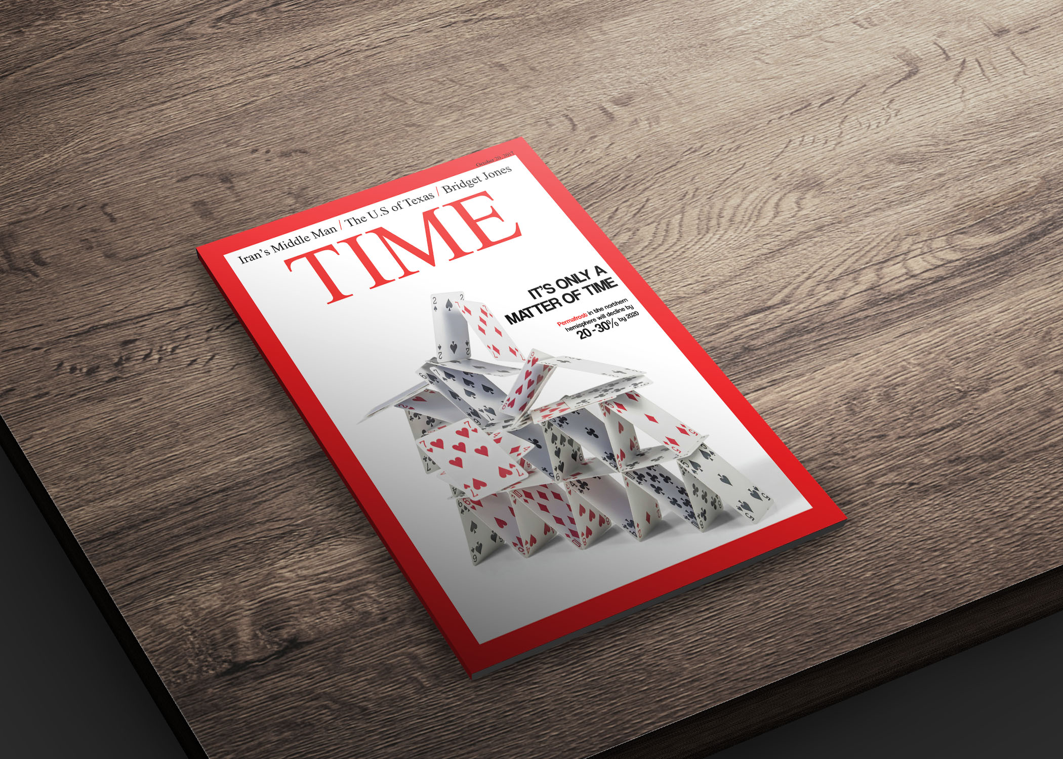
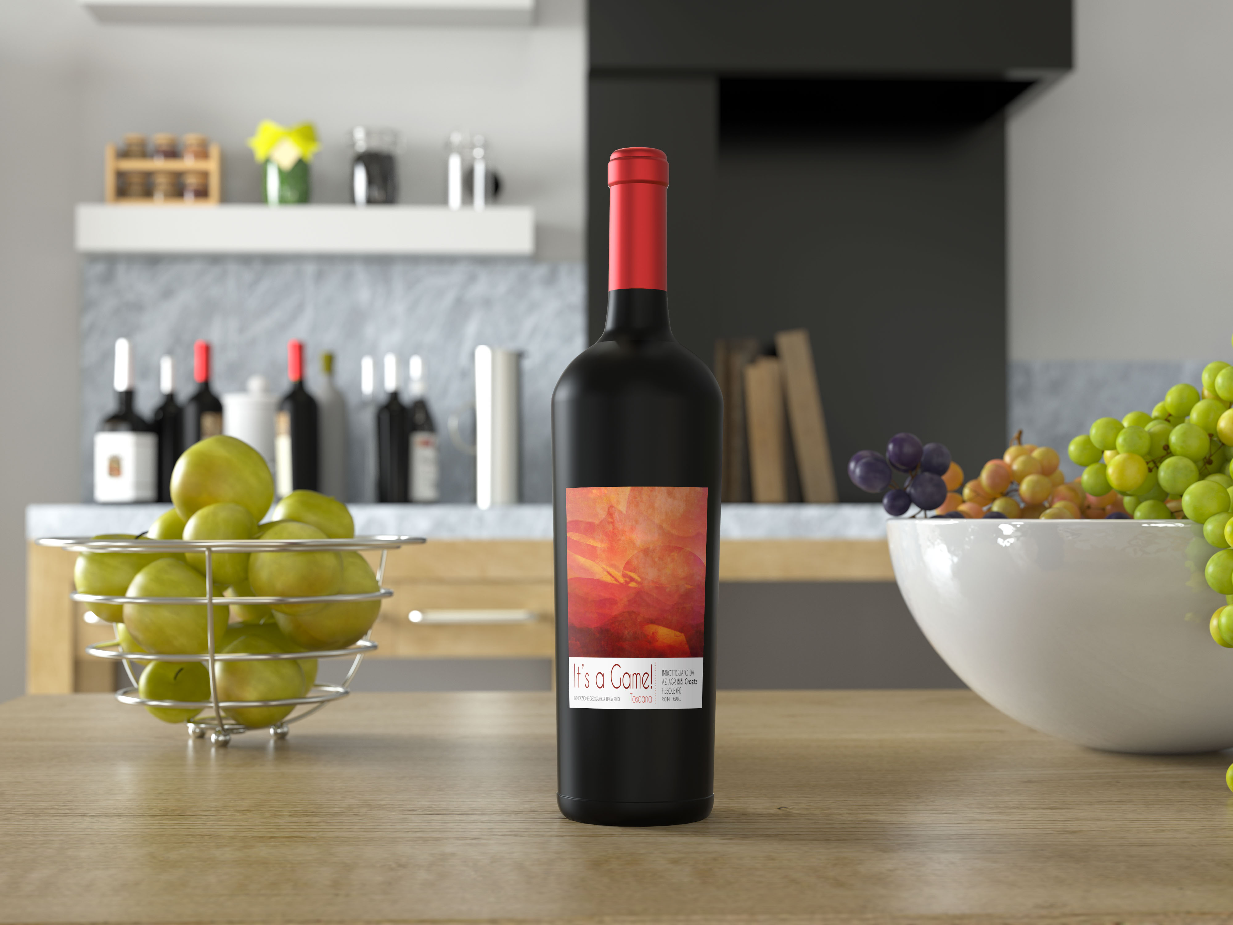
Projects

Ad Campaign
We were asked to create a visual using emotions/words and in this case I had the word “Power”. I chose the company Powerade and used a rocket ship to illustrate raw power of the engines as it takes off. I had to find a suitable image and manipulated the colors of the fuel to make them more orange and matched the text with the engine fumes.
Logo
For this personal project, I designed a logo for a friend competitive gaming team. He gave me the colors and he wanted to implement a gorilla as their team mascot to intimidate other teams. I went through a few different versions and this was the one they chose to use because it had a clear visual of the mascot, making it the first thing you see.
Ad Campaign
For this fun assignment, we had to make a menu for a store that we invent, name it something catchy and make a menu for it. “Donut resist” in other words “Do-not resist” because donuts always get the best of you. Something challenging was drawing different types of donuts was a bit difficult but finding the right name was harder.
Branding
Using a popular tea shop of our choice, in this case “David’s Tea”, we had to use their branding style to create a tea guide. We were allowed to rename the company to make it our own. Recreating the circular logo was the thing that took the longest for this project.
Logo
While working on a project where we had to use shapes to make a logo, I decided to use a triangle and a circle to create a shape that meshed the two. The final product was pretty interesting, although it did take me a while to get it right but in the end it made for an interesting modern visual that I just might send to YouTube.
Branding
For this unique project, we had to create a branding for a company called Trapeze. We had to do everything from business card to form as well as a letterhead. The challenge of this was to find a way to integrate the style of the logo in all the designs including the letterhead and business cards.
Branding
Using our initials, we had to make ourselves a logo that we might eventually put on our business cards. This was especially challenging for me because it wasn’t easy to mesh the “B” and the “A” in an appealing way. After trying a whole bunch of possibilities, the one I chose works best because it meshes the two letters together and it is easy to see the individual letterforms
Ad
The biggest challenge I encountered for this magazine cover was to find a way to visually show a metaphor for permafrost. Permafrost is a problem that affects buildings, streets and other infrastructure. I really struggled to find a way of showing what I had in mind. The initial visual was some kind of collapse in the ice. The visual didn’t work out, so I changed it to something more metaphorical which is the house of cards. I found this image of the collapsing cards online and it was a perfect fit for what I wanted to portray.
Logo
This project was one of the biggest projects in my three years at Vanier. Creating a brand identity for a wine company was a fun challenge. This is the second part of a two part project, this part was focused on creating their labels. The first part was creating a brochure and the challenge for this project was keeping the colours for the label which we used in the brochure.
Website
This is my first official website for a client. The Vanier College Teachers Association needed to change their entire website and they asked me to be the one to do it. This was fun for me because I was responsible for everything web related and I am really happy with the way the project came out.